Loading blog posts...
Back to Blog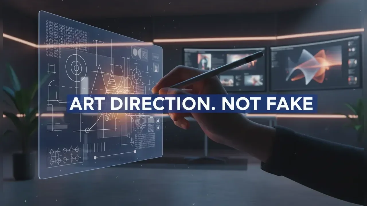
Also in
How to Make AI-Generated Designs Look Less AI-Generated in 2026
Half of what people call "AI-looking" design usually isn't about the model itself. From what I've seen, it's the missing art direction layer that real teams apply after the first generation.
By 2026, the fastest way to make designs look less AI-generated-without forcing a fake handmade vibe-is to use a repeatable prompt-to-polish pipeline that fixes the same dozen or so tells every single time.
Start with a de-AI pipeline, not better prompting
Example: A 6-stage "draft to deliverable" checklist
text1) Intent lock: define audience, channel, brand rules, and constraints (grid, type scale, color tokens). 2) Draft gen: generate 6-12 options with controlled variation (camera, lens, lighting, composition). 3) Tell scan: audit for AI artifacts (micro-details, shadow logic, edges, reflections, anatomy, typography). 4) Structural edits: fix perspective, geometry, layout, hierarchy, cropping. 5) Material edits: restore texture, noise, lens character, realistic imperfections (not fake handmade). 6) Brand pass: typography system, spacing system, color management, export specs, accessibility checks.
This kind of pipeline is exactly how creator communities already treat "de-AI-ing"-it's just standard post-production. Why? Because the same artifacts tend to pop up no matter which model or tool you use.
The real win here is consistency. Teams can stop praying for the perfect prompt and start shipping reliably polished design instead.
Important
[!IMPORTANT] "Less AI-generated" doesn't mean "more messy." It means applying coherent constraints, creating believable physics, and making brand-specific decisions that AI templates just can't replicate.
Example: A "tell scan" rubric designers can run in 90 seconds
textLighting: shadows consistent? specular highlights match material? one key light direction? Geometry: perspective lines converge correctly? object scale believable? Edges: halos, cutout fringing, over-sharpened contours, melted details? Micro-details: random symbols, fake text, repeated patterns, impossible seams? Reflections: mirror logic correct? reflections match environment and camera angle? Skin/materials: plastic smoothness, waxy gradients, poreless surfaces? Typography: kerning, baseline, optical alignment, real font use, consistent type scale? Composition: generic centered hero, symmetrical "AI poster" layout, no narrative focal path? Color: muddy neutrals, over-teal/orange, inconsistent white point across elements? Brand: does it obey spacing tokens, logo clear space, and component rules?
Run this before you even think about opening Photoshop or Figma. It’ll tell you whether you should regenerate, inpaint, or move straight into compositing.
Trend 1: "Constraint-first prompting" replaces style prompting
Prompt: Constraint-first brief for non-generic outcomes
textRole: senior art director. Deliverable: [ASSET_TYPE] for [CHANNEL] in [DIMENSIONS]. Audience: [AUDIENCE] with [CONTEXT]. Brand rules: - Typography: [FONT_1] headings, [FONT_2] body, type scale [TYPE_SCALE]. - Color tokens: [PRIMARY_HEX], [ACCENT_HEX], neutrals [NEUTRAL_SET]. - Layout: [GRID] with margins [MARGIN], spacing unit [SPACING_UNIT]. - Imagery: [PHOTO_STYLE_CONSTRAINTS] (no illustration, no hand-drawn artifacts). Subject: [SUBJECT] with [UNIQUE_DETAIL] that signals authenticity. Lighting: [LIGHTING_SETUP] with physically consistent shadows. Camera: [LENS_MM], [APERTURE], [ANGLE]. Output: 8 variations, each with a different composition rule (rule-of-thirds, diagonal, negative space, close crop). Avoid: generic poster layout, centered subject, random pseudo-text, over-smooth surfaces.
Style prompting ("make it cinematic") is easy for models to follow and, honestly, just as easy for people to spot.
Constraint-first prompting is much harder to fake because it bakes in real-world production limits: grids, spacing systems, typography intent, and channel requirements.
What this means: Teams that treat AI like a junior designer (giving it clear constraints, asking for multiple comps, and running a critique loop) will always outperform teams that treat AI like a vending machine.
Adoption timeline: Already common in 2025 among mature teams. By mid-2026 it becomes the default for any brand and UI-adjacent work.
Contrarian take: "More detail" prompts can increase AI tells
Shoving too much detail into a prompt often backfires, pushing the model toward "averaged" solutions: generic composition, hyper-clean surfaces, and boring, stock-like lighting. Constraint-first prompts are different. They reduce randomness where it matters (like layout and physics) and leave room for creative variation where it actually helps (like trying out different compositions).
Trend 2: The new realism is "physics-consistent," not "photoreal"
Prompt: Lighting and shadow logic lock (for believable composites)
textGoal: physically consistent studio scene for compositing. Subject: [PRODUCT] on [SURFACE_MATERIAL]. Lighting: - Key: [LIGHT_TYPE] at 45 degrees camera-left, soft shadows, defined contact shadow. - Fill: subtle, 2 stops lower than key. - Rim: thin highlight, camera-right. Environment: neutral studio, no windows. Camera: 85mm lens, eye-level, minimal distortion. Materials: accurate roughness and specular response (no plastic sheen). Output: clean background, preserve natural noise, no HDR glow.
AI images constantly break on "shadow logic"-things like contact shadows, direction, and how the light intensity falls off.
But if you fix the light consistency, the whole design starts to feel like it was shot with a camera, not just generated. That's the one thing most people react to, even if they can't quite put their finger on why.
What this means: You'll see more teams building internal "lighting presets" and reusing them across campaigns. Consistent light itself becomes a brand cue.
Adoption timeline: Late 2026 for most marketing teams, but earlier for product-led brands with strong visual QA.
Example: A quick compositing fix list (no regeneration required)
text- Add contact shadow manually under every grounded object (multiply layer, soft mask). - Match black point and white point across all elements (levels/curves). - Add a single shared grain/noise layer over the full comp (overlay/soft light). - Introduce lens vignette and subtle chromatic aberration consistently (at a very low setting).
These little edits get rid of that "each object was generated separately" vibe.
Trend 3: Texture reinstatement becomes a standard finishing step
Prompt: "Restore real texture" pass (avoid plastic skin and surfaces)
textTask: generate a texture-only overlay to reintroduce realism. Target: [SKIN / FABRIC / PAPER / METAL]. Requirements: - natural micro-contrast, no painterly strokes, no hand-drawn look - avoid waxy gradients, avoid over-sharpening - realistic pores/fibers/grain appropriate to [AGE / MATERIAL_GRADE] Output: seamless texture overlay, neutral color, midtone-focused, 4K.
More and more, the best tools and workflows are treating texture as a totally separate layer you can control. In my experience, this is the fastest way to kill that classic "AI smoothness" tell without wrecking the rest of the image.
This lines up with the rise of specialized "skin texture enhancement" tools and the broader push to get rid of that too-perfect surface look.
What this means: Designers will start maintaining texture libraries for each brand (paper grain, print noise, fabric weave) just like they maintain icon sets.
Adoption timeline: Already happening in photo-retouching circles. By 2026, it will have spread into mainstream brand teams.
Warning
[!WARNING] Be careful, because over-texturing creates a new tell: the classic "grunge overlay pasted on top." A good texture has to match the image's scale, lighting, and material roughness, or it'll look just as fake.
Example: Texture matching rules that prevent fake overlays
text- Scale: texture frequency must match camera distance (a close-up needs finer detail). - Direction: fabric and brushed metal need directional grain that's aligned to the object's form. - Masking: texture should fade in the highlights and deep shadows (don't just apply it uniformly). - Color: keep the texture layer neutral; let the underlying color show through.
Trend 4: Anti-generic composition is a competitive advantage
Prompt: Composition generator that avoids the "AI poster"
textCreate 10 composition thumbnails for [ASSET_TYPE] without rendering details. Constraints: - Use asymmetry and negative space. - Place focal point off-center with a clear visual path. - Include one "imperfect" crop (partial subject) and one extreme close-up. - Reserve text-safe zones: top [X%], bottom [Y%], left [Z%]. - Avoid centered hero + symmetrical framing. Return: layout descriptions + bounding boxes in percentages.
Generic composition is one of the loudest AI tells because models are trained to converge on safe, boring poster layouts.
Forcing some compositional variety at the thumbnail stage is the best way to keep things from getting "samey" before you even start polishing pixels.
What this means: Art direction is shifting earlier in the process. Teams will start judging compositions as wireframes first, and renders second.
Adoption timeline: Mid-2026 for teams that are producing a high volume of ad variants.
Example: A layout QA checklist for "designed, not generated"
text- One primary focal point, one secondary, and one tertiary (not five equally important ones). - Text hierarchy: 3 levels max for ads (headline, subhead, CTA). - Clear reading order for the target language (LTR/RTL). - Consistent margins and baseline grid alignment. - Intentional imbalance (in weight distribution) rather than perfect symmetry.
If a layout passes this check, it reads as authored by a person, even if the imagery is AI-assisted.
Trend 5: Typography becomes the easiest "de-AI" lever
Template: Type system spec for brand-consistent outputs
text[PROJECT] Type System Heading font: [FONT_NAME] weights [W1, W2] Body font: [FONT_NAME] weights [W1, W2] Type scale (px): Line height: headings [1.1-1.2], body [1.4-1.6] Letter spacing: headings [-1% to -3%], body [0%] Max line length: characters CTA rules: uppercase [YES/NO], tracking [+2%], min size [16px] Do not use: faux condensed, fake small caps, AI-generated letterforms
AI-generated text and letterforms still get weird, and they get weird fast-think inconsistent kerning, warped baselines, and bizarre fake glyphs.
The cleanest fix is to simply never accept generated typography. Replace it with a real type system in Figma, Illustrator, or CSS. Yes, it’s a bit of a boring solution, but it works every time.
What this means: "AI design" that actually ships will be image-first, type-last. Typography is what becomes the final authenticity stamp.
Adoption timeline: Already standard practice in serious brand teams. By 2026, even small teams will adopt this because it’s fast and has a huge impact.
Data point: measurable outcomes from typography and systemization
This isn't just theory. Look at the data:
Shopify cut its design-to-dev handoff friction by 50% after standardizing its component and typography system (Polaris).
Spotify improved design consistency and speed by consolidating its product UI rules into a shared design system, which cut down on duplicated patterns.
Airbnb sped up its multi-team UI delivery after adopting a design language system, slashing rework by enforcing shared tokens and components.
This is the power of a design system in action: fewer one-off decisions, fewer "template vibes," and way more coherent outputs.
Trend 6: "Style transfer" gets used like seasoning, not the main dish
Prompt: Minimal style transfer to avoid the "transfer signature"
textGoal: apply subtle style influence without obvious transfer artifacts. Base image: [BASE_IMAGE_DESCRIPTION]. Style reference: [STYLE_REFERENCE_DESCRIPTION] at 10-20% strength. Preserve: - original lighting direction - original material properties - original facial proportions (if present) Change: - color palette bias toward [PALETTE] - edge behavior (slightly softer) - film response (gentle highlight roll-off) Avoid: - brushstroke textures - posterization - pattern repetition
Style transfer can be a quick way to move an image away from the "default model aesthetic," but it can also introduce its own recognizable look (you’ve probably seen it).
The trick is to use it lightly, then finish the job with real design constraints (type, grid, color management). This keeps the style transfer itself from becoming the new tell.
What this means: The market is moving away from "pick a style" and toward "build a look pipeline." The pipeline itself becomes the differentiator.
Adoption timeline: Late 2026 for in-house teams, but earlier for studios producing campaigns at scale.
Trend 7: Brand systems and tokens become the anti-AI signature
Example: A token pack that forces brand coherence across AI and non-AI work
json{ "color": { "primary": "#1B5BFF", "accent": "#FF3D81", "neutral": { "900": "#0B0F1A", "700": "#2A3142", "500": "#59627A", "100": "#EEF1F7" } }, "spacing": { "unit": 8, "scale": [8, 16, 24, 32, 48, 64, 96] }, "radius": { "sm": 6, "md": 12, "lg": 20 }, "shadow": { "elev1": "0 2px 8px rgba(11,15,26,0.12)", "elev2": "0 8px 24px rgba(11,15,26,0.16)" } }
When AI outputs just float around without a system, they read as generated.
Tokens force repeatable decisions across all your layouts, UI, and marketing materials. The result looks designed because, well, it is constrained.
What this means: "De-AI-ing" your work becomes partly a design ops problem. Teams will need to invest in tokens, templates, and even QA automation.
Adoption timeline: By 2026, most scaling teams will already have tokens. The shift will be using them to post-process AI outputs, not just for UI work.
Tip
[!TIP] Treat AI imagery like you treat stock photography: it only becomes brand-safe after your tokenized color, typography, and layout rules are applied.
Example: A brand QA pass that catches AI tells at scale
text- Check color: map to tokens, remove near-miss colors (like off-brand blues). - Check spacing: snap to an 8px grid, normalize padding across all variants. - Check type: replace all raster text with live text, enforce the type scale. - Check accessibility: check contrast ratios for text overlays, check minimum sizes for mobile. - Check export: use consistent sharpening, compression, and color profiles.
This is how "AI-assisted design" becomes shippable design.
Tools and workflow choices in 2026 (what changes outcomes fastest)
Table: Where "AI-looking" artifacts are best fixed
| Stage | Best Fix Method | Typical AI Tells Removed | Trade-offs |
|---|---|---|---|
| Generation | Constraint-first prompts + better model choice | generic composition, wrong lens feel | still needs post for micro-details |
| Inpainting | Targeted repairs (hands, teeth, edges, logos) | anatomy failures, melted objects | can create patch seams if not blended |
| Compositing | Manual layer work + shared grain | inconsistent lighting, "cutout" look | requires design skill and time |
| Retouching | Frequency separation, dodge/burn, texture overlays | plastic skin, flat materials | easy to overdo, needs restraint |
| Brand pass | Tokens, type system, grid enforcement | template vibe, inconsistent hierarchy | depends on having a real system |
| QA automation | Checklists + scripted exports | inconsistent outputs across variants | setup cost upfront |
This is the non-handmade path: you make the work feel authored through coherence, not through fake imperfections.
Common questions people search in 2026 (answers you can apply today)
Prompt: "Fix the top 5 AI tells" regeneration request
textRegenerate this image with the same composition. Fix these issues: 1) Lighting: unify key light direction to camera-left, add contact shadows. 2) Materials: remove plastic sheen, increase realistic micro-texture. 3) Edges: remove halos and over-sharpening, preserve natural softness. 4) Micro-details: remove random symbols and repeated patterns. 5) Color: neutral white balance, avoid teal/orange grading. Keep: [WHAT_TO_KEEP]. Output: high-res, minimal artifacts, no text.
This prompt works because it names specific failure modes that models can actually correct. It avoids the vague "make it less AI" request that tends to go nowhere.
Example: When to stop editing and regenerate instead
textRegenerate when: - perspective is fundamentally wrong - reflections are impossible (mirror logic is broken) - anatomy is structurally incorrect (hands, teeth, eyes) Edit when: - edges just need some cleanup - texture needs to be reintroduced - color and contrast need to be normalized - the composition is good but the details are a little off
A common productivity trap is spending 45 minutes polishing an image that has fundamentally broken geometry. (Ask me how I know.)
Template: A "no fake handmade" policy that still adds authenticity
textAuthenticity rules: - No fake brush strokes, fake paper tears, or forced wobble lines. - Any imperfections must be physically plausible: lens noise, film grain, print dot gain, slight misregistration. - Always use real typography and real layout systems. - Add provenance through constraints: a consistent lighting preset, consistent crop rules, consistent token mapping.
This approach keeps your work looking modern and credible, which is especially important for tech and product brands.
For prompt-heavy workflows, pair this post with Joulyan IT Solutions' prompt library guides like Best Nano Banana Pro Prompt Examples for Designers 2026 and Best Nano Banana Pro Prompts: 50+ Examples (2026) to standardize generation inputs across a team.
Action Steps
Start here (your first step)
Create a de-ai-checklist.md and run the 90-second "tell scan" on 20 of your recent assets.
Quick wins (immediate impact)
- Replace all AI-rendered text with live typography in Figma using a fixed 7-step type scale.
- Add one shared grain layer and one shared color grade layer to every composite variant you make.
Deep dive (for those who want more)
- Build a brand token pack (
color,spacing,radius,shadow) and map every exported asset to those tokens. - Create three lighting presets (studio, overcast outdoor, indoor window) and start requiring them in your prompts.
Useful Resources
- AI in Graphic Design: How It Works & Expert Tips for 2026 - Industry perspective on AI workflows and team adoption.
- 10 Tips to Perfectly Edit AI-Generated Images - Practical editing checklist aligned with common artifact categories.
- Enhancor - Specialized tool for correcting AI-like skin texture artifacts.
- Best AI Style Transfer Tools to 100x Your Creativity | 2026 Curated List - Overview of style transfer options and typical use cases.
- Best Ways to "De-AI" Generated Photos or Videos?: r/StableDiffusion - Community workflow discussion that frames de-AI as standard post-production.
Looking Ahead
Ultimately, making work look "less AI-generated" in 2026 comes down to your process. It's about using constraint-first prompts, being aggressive with your tell scanning, and committing to a real finishing pass that enforces physics and brand systems.
The teams that win aren't going to be the ones chasing fake handmade cues. They'll be the ones shipping coherent work faster by treating AI output as what it is-draft material-and applying repeatable art direction and QA on top.
If your team needs help turning these ideas into practical templates, token packs, and automated export pipelines, Joulyan IT Solutions can help you integrate AI and automate your workflows without compromising your brand's unique design standards.


